
LUUP
⬇DESIGN.md日本の電動マイクロモビリティシェアリングブランド。「街じゅうを『駅前化』するインフラをつくる」をミッションに掲げ、ティール系グリーンと白を軸にしたクリーン&テクノロジカルなビジュアルアイデンティティ。
Color Palette
Primary
Surface Teal
Text
Neutral
Surface
Typography
Fonts
Roobert
primary"Roobert", "Noto Sans JP", "Yu Gothic", "YuGothic", "Hiragino Kaku Gothic Pro", sans-serif
ブランドフォント。ローカル配信 woff2、Light(300) / Regular(500) / Bold(700) の3ウェイト。外部埋め込み不可のため、代替として Inter または DM Sans を推奨。
Noto Sans JP
japanese"Hiragino Sans", "Noto Sans JP", "Yu Gothic", "YuGothic", "Hiragino Kaku Gothic Pro", "Meiryo UI", "Meiryo", "MS PGothic", sans-serif
日本語専用スタック。Hiragino Sans が優先。
Type Scale
日本語タイポグラフィ
禁則処理・行間・字間・OpenType 機能の設定
- フォントスタック
"Hiragino Sans", "Noto Sans JP", "Yu Gothic", "YuGothic", "Hiragino Kaku Gothic Pro", "Meiryo UI", "Meiryo", "MS PGothic", sans-serif- 行間
- 1.7(欧文 1.43 に対し約 19% 広い)
- 字間
- 0.04em
- 禁則処理
word-break: keep-allline-break: strictoverflow-wrap: anywhere- OpenType
- palt(プロポーショナル仮名): offkern: on
「日本語タイポグラフィの再現」
私たちは、文字の美しさと読みやすさを両立させるデザインを追求しています。 Webフォントは表示速度に影響しますが、適切な行間(line-height)と字間 (letter-spacing)を設定することで、可読性が向上します。 禁則処理を適用することで、行末に句読点や括弧が来るのを防ぎます。
※ 日本語の可読性を優先。Hiragino Sans が macOS / iOS のシステムフォントとして優先される。Roobert は欧文専用なので、日本語は必ず fallback で日本語フォントを使用。
Spacing
ベースユニット: 0.25rem
0.5rem最小間隔(8px)0.75rem小間隔(12px)1rem標準間隔(16px)1.5rem大間隔(24px)2remセクション内余白(32px)3remセクション間(48px)4rem標準セクション余白(64px)6rem大セクション余白(96px)Shape
Border Radius
none
0
small
2px
default
4px
medium
8px
large
10px
pill
28px
pill-large
54px
full
9999px
※ ボタンは pill (28px) が基本。カードは large (10px)。タグは default (4px)。
Components
Button
Primary Button
ブランドカラーのプライマリ CTA。pill 形状で視認性が高い。
Outline Button
アウトライン形式のセカンダリ CTA。
Dark Button
App Store スタイルのダーク CTA。アプリダウンロードリンクで使用。
Navigation
Sticky Navbar
白背景の sticky ナビゲーション。ロゴ左、CTA 右の構成。モバイルではハンバーガーメニューに折り畳む。
Default
Card
News Card
ニュース・記事カード。サムネイル + タグ + タイトル構成。ホバー時に画像がズーム、テキストにアンダーラインが付く。
Section
Teal Section
ティール tint のセクション背景。ポート紹介・CTA エリアで使用。
セクションタイトル
キャッチコピーや説明文がここに入ります
tag
Tag
カテゴリタグ。ニュースカード内などで使用。
Default
input
Form Input
フォーム入力フィールド。フォーカス時にプライマリカラーのボーダー。
Default
Focus
Guidelines
Do
- ティールカラーは白背景と組み合わせる(コントラスト比確保)
- ボタンは pill 形状(border-radius: 28px〜54px)を使う
- 日本語テキストは Noto Sans JP / Hiragino Sans を確実に fallback に含める
- セクション区切りには余白(4rem 以上)を取り、密集を避ける
- 画像はホバー時に scale(1.2) でズームさせることでインタラクティブ性を演出
- ニュースカードにはカテゴリタグ(#DADEE6 背景)を付ける
Don't
- プライマリカラーを背景と前景で同系色に使う(可読性低下)
- border-radius を 0 や矩形のままボタンに使う(ブランドらしくない)
- 小サイズ(12px 未満)で Roobert を使う(日本語 fallback が効かない)
- 複数のティール濃度を隣接させる(#00B6AC と #00D1B2 を並べない)
- 背景画像の上に直接テキストを置く(オーバーレイか枠なし)
- フッター以外でダーク背景(#0A0A0A)を広範に使う
---
version: alpha
name: LUUP
description: 日本の電動マイクロモビリティシェアリングブランド。「街じゅうを『駅前化』するインフラをつくる」をミッションに掲げ、ティール系グリーンと白を軸にしたクリーン&テクノロジカルなビジュアルアイデンティティ。
sources:
- https://luup.sc/
- https://luup.sc/wp-content/themes/luup-2023/assets/css/style.css?ver=20260407
notes:
- ブランドプライマリカラーは CSS 中で最頻出の #00B6AC(51回)。Bulma の is-primary は #00D1B2 に設定されているが、実際のサイトでは #00B6AC が支配的。
- フォント Roobert はローカルホスト配信(woff2)。外部埋め込み不可のため、代替として Inter または DM Sans を推奨。
- Bulma CSS フレームワーク + カスタム WordPress テーマ(luup-2023)ベース。
- /brand/ および /press/ はアクセス不可(404)。ロゴ使用ガイドラインは公式プレスキットを要確認。
- 画像・写真は著作権により再利用不可。デモでは SVG プレースホルダーを使用。
colors:
primary: "#00B6AC"
primary-light: "#00D1B2"
primary-hover: "#00B89C"
primary-active: "#009D94"
primary-dark: "#00947E"
primary-darkest: "#00837C"
surface-teal-50: "#EBFFFC"
surface-teal-100: "#D1FFF8"
text-primary: "#0A0A0A"
text-secondary: "#313636"
text-muted: "#4A4A4A"
text-light: "#666666"
neutral-lightest: "#F2F2F2"
neutral-light: "#DADEE6"
neutral-mid: "#CBD0DC"
neutral-border: "#B5B5B5"
surface-white: "#FFFFFF"
surface-dark: "#121212"
surface-near-black: "#0A0A0A"
typography:
display:
fontFamily: '"Roobert", "Noto Sans JP", "Yu Gothic", "YuGothic", "Hiragino Kaku Gothic Pro", sans-serif'
fontSize: "3.5rem"
fontWeight: 700
lineHeight: 1.2
h1:
fontFamily: '"Roobert", "Noto Sans JP", "Yu Gothic", "YuGothic", "Hiragino Kaku Gothic Pro", sans-serif'
fontSize: "2.5rem"
fontWeight: 700
lineHeight: 1.3
h2:
fontFamily: '"Roobert", "Noto Sans JP", "Yu Gothic", "YuGothic", "Hiragino Kaku Gothic Pro", sans-serif'
fontSize: "2rem"
fontWeight: 700
lineHeight: 1.4
h3:
fontFamily: '"Roobert", "Noto Sans JP", "Yu Gothic", "YuGothic", "Hiragino Kaku Gothic Pro", sans-serif'
fontSize: "1.5rem"
fontWeight: 600
lineHeight: 1.4
body:
fontFamily: '"Roobert", "Noto Sans JP", "Yu Gothic", "YuGothic", "Hiragino Kaku Gothic Pro", "Meiryo UI", "Meiryo", "MS PGothic", sans-serif'
fontSize: "1rem"
fontWeight: 400
lineHeight: 1.5
body-small:
fontSize: "0.875rem"
fontWeight: 400
lineHeight: 1.5
label:
fontSize: "0.75rem"
fontWeight: 500
lineHeight: 1.4
rounded:
none: "0"
small: "2px"
default: "4px"
medium: "8px"
large: "10px"
pill: "28px"
pill-large: "54px"
full: "9999px"
spacing:
base: "0.25rem"
xs: "0.5rem"
sm: "0.75rem"
md: "1rem"
lg: "1.5rem"
xl: "2rem"
xxl: "3rem"
section: "4rem"
section-large: "6rem"
components:
button-primary:
backgroundColor: "#00B6AC"
color: "#FFFFFF"
borderRadius: "28px"
fontFamily: "{typography.body.fontFamily}"
fontWeight: 600
fontSize: "1rem"
padding: "0.75em 1.5em"
hover-backgroundColor: "#00B89C"
button-outline:
backgroundColor: "transparent"
color: "#00B6AC"
border: "2px solid #00B6AC"
borderRadius: "28px"
hover-backgroundColor: "#EBFFFC"
button-dark:
backgroundColor: "#0A0A0A"
color: "#FFFFFF"
borderRadius: "28px"
card:
backgroundColor: "#FFFFFF"
borderRadius: "10px"
overflow: "hidden"
imageHoverTransform: "scale(1.2)"
imageTransition: "0.5s"
contentHoverDecoration: "underline"
tag:
backgroundColor: "#DADEE6"
color: "#313636"
borderRadius: "4px"
fontSize: "0.75rem"
padding: "0.25em 0.75em"
navbar:
backgroundColor: "#FFFFFF"
height: "3rem"
position: "sticky"
zIndex: 30
linkColor: "#0A0A0A"
linkHoverBackground: "#F2F2F2"
input:
borderRadius: "4px"
border: "1px solid #DADEE6"
focusBorder: "#00B6AC"
fontSize: "1rem"
padding: "0.5em 0.75em"
section-teal:
backgroundColor: "#EBFFFC"
borderTop: "none"
---
## Overview
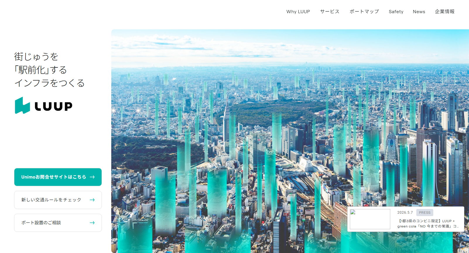
LUUP(株式会社Luup)は日本の電動マイクロモビリティシェアリングサービス。電動キックボード・電動アシスト自転車の短距離移動インフラを提供し、「街じゅうを『駅前化』するインフラをつくる」をコーポレートミッションに掲げる。
ビジュアルアイデンティティは **ティール(青緑)を基軸** にし、白・黒と組み合わせることで清潔感・テクノロジー感・持続可能性を表現する。グラフィックは余白を活かしたミニマルレイアウトで、日本のプロダクトUIらしい情報密度を保ちつつも開放感がある。
## Colors
| トークン | 値 | 用途 |
|---|---|---|
| `primary` | `#00B6AC` | CTA ボタン、アクセントリンク、アイコン — ブランドの主役色 |
| `primary-light` | `#00D1B2` | ホバー演出、ライトな強調 |
| `primary-hover` | `#00B89C` | ボタン hover/active 状態 |
| `primary-active` | `#009D94` | pressed / visited |
| `primary-dark` | `#00947E` | ダークモード・コントラスト強化が必要な場面 |
| `surface-teal-50` | `#EBFFFC` | セクション背景、カードtint |
| `surface-teal-100` | `#D1FFF8` | より強調したtint |
| `text-primary` | `#0A0A0A` | 本文・見出し |
| `text-secondary` | `#313636` | サブテキスト |
| `text-muted` | `#4A4A4A` | キャプション、補足 |
| `neutral-light` | `#DADEE6` | タグ背景、ボーダー、区切り線 |
| `neutral-mid` | `#CBD0DC` | ホバー背景 |
| `neutral-border` | `#B5B5B5` | カード枠線 |
| `surface-white` | `#FFFFFF` | ページ・ナビ背景 |
| `surface-dark` | `#121212` | ダークセクション背景 |
**注意点**:
- プライマリカラーはティール系の中でも `#00B6AC` が最も使用頻度が高い(純テキストで51回、背景で38回)
- Bulma の `is-primary` は `#00D1B2` に設定されているが、カスタム UI では `#00B6AC` が優先される
- カラーは白黒との二色使いが多く、グラデーションはほぼ使用されない
## Typography
### フォントスタック
**Latin / 数字向け(ブランドフォント)**: Roobert
- ローカル配信 woff2、Light(300) / Regular(500) / Bold(700) の3ウェイト
- 外部埋め込み不可のため、パブリックプロジェクトでは **Inter** または **DM Sans** を代替推奨
**Japanese**: `"Hiragino Sans", "Noto Sans JP", "Yu Gothic", "YuGothic", "Hiragino Kaku Gothic Pro", "Meiryo UI", "Meiryo", "MS PGothic"`
**実装フルスタック**:
```css
font-family: "Roobert", "Noto Sans JP", "Yu Gothic", "YuGothic",
"Hiragino Kaku Gothic Pro", "Meiryo UI", "Meiryo",
"MS PGothic", sans-serif;
```
### タイポグラフィスケール
| ロール | サイズ | ウェイト | 用途 |
|---|---|---|---|
| Display | 3.5rem / 56px | 700 | ファーストビュー大見出し |
| H1 | 2.5rem / 40px | 700 | ページタイトル |
| H2 | 2rem / 32px | 700 | セクション見出し |
| H3 | 1.5rem / 24px | 600 | カード見出し、小セクション |
| Body | 1rem / 16px | 400 | 本文 |
| Body Small | 0.875rem / 14px | 400 | キャプション、ラベル |
| Label/Tag | 0.75rem / 12px | 500 | タグ、バッジ |
行間は基本 `1.5`、見出しは `1.2〜1.4`。
## Layout
- **フレームワーク**: Bulma CSS(カラム・フレックスレイアウト)
- **コンテナ幅**: `is-max-widescreen`(最大 1216px)
- **ブレイクポイント**:
- Mobile: ≤ 768px
- Tablet: 769px〜1023px
- Desktop: ≥ 1024px
- Widescreen: ≥ 1216px
- **セクション間余白**: 4rem〜6rem(デスクトップ)/ 2rem〜3rem(モバイル)
- **カラムガップ**: 0.75rem〜1.5rem(Bulma 変数)
ページ構造(トップページ):
1. Sticky Navbar(白背景、ロゴ左・CTA右)
2. Hero(フルスクリーン画像 + テキストオーバーレイ + アプリDLボタン)
3. Why LUUP(3カラム: インフラ・安全・サステナビリティ)
4. ポート紹介セクション(薄ティール背景)
5. サービス概要(リンクカード群)
6. ニュースグリッド(サムネイル + タグ + タイトル)
7. ポート設置CTA
8. アプリDLセクション
9. フッター(ダーク背景)
## Components
### ナビゲーションバー
```
[LUUP ロゴ] Why LUUP | Service | Port Map | Safety | News | Company [アプリDL▶]
```
- 白背景 sticky、高さ 3rem、z-index 30
- モバイルはハンバーガーアイコンに折り畳む
- アプリ DL ボタンはプライマリボタンで常時表示
### ボタン
**Primary**
```css
background-color: #00B6AC;
color: #fff;
border-radius: 28px; /* pill shape */
font-weight: 600;
padding: 0.75em 1.5em;
```
hover: `#00B89C` / active: `#009D94`
**Outline**
```css
background: transparent;
color: #00B6AC;
border: 2px solid #00B6AC;
border-radius: 28px;
```
**Dark (App Store style)**
```css
background-color: #0A0A0A;
color: #fff;
border-radius: 28px;
```
### カード
```css
background: #fff;
border-radius: 10px;
overflow: hidden;
/* img hover */
img { transition: 0.5s; }
&:hover img { transform: scale(1.2); }
&:hover .content { text-decoration: underline; }
```
サムネイル比率は 16:9(news)または正方形(feature)。
### タグ / バッジ
```css
background-color: #DADEE6;
color: #313636;
border-radius: 4px;
font-size: 0.75rem;
padding: 0.25em 0.75em;
```
### フォーム入力
```css
border: 1px solid #DADEE6;
border-radius: 4px;
padding: 0.5em 0.75em;
font-size: 1rem;
/* focus */
border-color: #00B6AC;
outline: none;
```
### セクション背景バリエーション
| バリアント | 色 | 使用場面 |
|---|---|---|
| White | `#FFFFFF` | デフォルト |
| Teal-tint | `#EBFFFC` | ポートCTA、注目セクション |
| Light gray | `#F2F2F2` | 区切り・補足セクション |
| Near-black | `#0A0A0A` | フッター、ダーク強調 |
## Imagery
**写真スタイル**:
- 実際の路上・都市空間での電動スクーター・自転車の利用シーン
- 自然光、明るいトーン、日本の都市景観(東京・大阪・京都など)
- 人物は若年〜中年の多様な属性、安心感と利便性を訴求
- WebP フォーマット(-pc.webp / -mobile.webp でレスポンシブ)
**アイコン**:
- シンプルなラインアイコン、Bulma `.icon` クラス内に配置
- カテゴリ: スクーター、自転車、地図ピン、アプリ、安全ヘルメット
**禁止事項**:
- 過激なスタント・危険走行のイメージ
- 混雑した密集シーン(安全コミュニケーションと相反)
## Logo And Usage
- ロゴタイプ: "LUUP"(全大文字、Roobert Bold ベース)
- 公式ロゴ素材は https://luup.sc/ のプレスキット(要申請)から取得
- カラー使用: ティール (#00B6AC) on 白背景、または白 on ダーク背景
- 単色モノクロ(黒・白)使用可
- 最小サイズ: 80px 幅以上
- クリアスペース: ロゴ高さの 50% 以上を周囲に確保
**禁止**:
- ロゴの変形・回転・斜体化
- 非ブランドカラーでの使用
- テキストの上に重ねること(コントラスト確保のため除く)
## Do's and Don'ts
### Do
- ティールカラーは白背景と組み合わせる(コントラスト比確保)
- ボタンは pill 形状(border-radius: 28px〜54px)を使う
- 日本語テキストは Noto Sans JP / Hiragino Sans を確実に fallback に含める
- セクション区切りには余白(4rem 以上)を取り、密集を避ける
- 画像はホバー時に scale(1.2) でズームさせることでインタラクティブ性を演出
- ニュースカードにはカテゴリタグ(#DADEE6 背景)を付ける
### Don't
- プライマリカラーを背景と前景で同系色に使う(可読性低下)
- border-radius を 0 や矩形のままボタンに使う(ブランドらしくない)
- 小サイズ(12px 未満)で Roobert を使う(日本語 fallback が効かない)
- 複数のティール濃度を隣接させる(#00B6AC と #00D1B2 を並べない)
- 背景画像の上に直接テキストを置く(オーバーレイか枠なし)
- フッター以外でダーク背景 (#0A0A0A) を広範に使う
LUUP
⬇DESIGN.md日本の電動マイクロモビリティシェアリングブランド。「街じゅうを『駅前化』するインフラをつくる」をミッションに掲げ、ティール系グリーンと白を軸にしたクリーン&テクノロジカルなビジュアルアイデンティティ。
Color Palette
Primary
Surface Teal
Text
Neutral
Surface
Typography
Fonts
Roobert
primary"Roobert", "Noto Sans JP", "Yu Gothic", "YuGothic", "Hiragino Kaku Gothic Pro", sans-serif
ブランドフォント。ローカル配信 woff2、Light(300) / Regular(500) / Bold(700) の3ウェイト。外部埋め込み不可のため、代替として Inter または DM Sans を推奨。
Noto Sans JP
japanese"Hiragino Sans", "Noto Sans JP", "Yu Gothic", "YuGothic", "Hiragino Kaku Gothic Pro", "Meiryo UI", "Meiryo", "MS PGothic", sans-serif
日本語専用スタック。Hiragino Sans が優先。
Type Scale
日本語タイポグラフィ
禁則処理・行間・字間・OpenType 機能の設定
- フォントスタック
"Hiragino Sans", "Noto Sans JP", "Yu Gothic", "YuGothic", "Hiragino Kaku Gothic Pro", "Meiryo UI", "Meiryo", "MS PGothic", sans-serif- 行間
- 1.7(欧文 1.43 に対し約 19% 広い)
- 字間
- 0.04em
- 禁則処理
word-break: keep-allline-break: strictoverflow-wrap: anywhere- OpenType
- palt(プロポーショナル仮名): offkern: on
「日本語タイポグラフィの再現」
私たちは、文字の美しさと読みやすさを両立させるデザインを追求しています。 Webフォントは表示速度に影響しますが、適切な行間(line-height)と字間 (letter-spacing)を設定することで、可読性が向上します。 禁則処理を適用することで、行末に句読点や括弧が来るのを防ぎます。
※ 日本語の可読性を優先。Hiragino Sans が macOS / iOS のシステムフォントとして優先される。Roobert は欧文専用なので、日本語は必ず fallback で日本語フォントを使用。
Spacing
ベースユニット: 0.25rem
0.5rem最小間隔(8px)0.75rem小間隔(12px)1rem標準間隔(16px)1.5rem大間隔(24px)2remセクション内余白(32px)3remセクション間(48px)4rem標準セクション余白(64px)6rem大セクション余白(96px)Shape
Border Radius
none
0
small
2px
default
4px
medium
8px
large
10px
pill
28px
pill-large
54px
full
9999px
※ ボタンは pill (28px) が基本。カードは large (10px)。タグは default (4px)。
Components
Button
Primary Button
ブランドカラーのプライマリ CTA。pill 形状で視認性が高い。
Outline Button
アウトライン形式のセカンダリ CTA。
Dark Button
App Store スタイルのダーク CTA。アプリダウンロードリンクで使用。
Navigation
Sticky Navbar
白背景の sticky ナビゲーション。ロゴ左、CTA 右の構成。モバイルではハンバーガーメニューに折り畳む。
Default
Card
News Card
ニュース・記事カード。サムネイル + タグ + タイトル構成。ホバー時に画像がズーム、テキストにアンダーラインが付く。
Section
Teal Section
ティール tint のセクション背景。ポート紹介・CTA エリアで使用。
セクションタイトル
キャッチコピーや説明文がここに入ります
tag
Tag
カテゴリタグ。ニュースカード内などで使用。
Default
input
Form Input
フォーム入力フィールド。フォーカス時にプライマリカラーのボーダー。
Default
Focus
Guidelines
Do
- ティールカラーは白背景と組み合わせる(コントラスト比確保)
- ボタンは pill 形状(border-radius: 28px〜54px)を使う
- 日本語テキストは Noto Sans JP / Hiragino Sans を確実に fallback に含める
- セクション区切りには余白(4rem 以上)を取り、密集を避ける
- 画像はホバー時に scale(1.2) でズームさせることでインタラクティブ性を演出
- ニュースカードにはカテゴリタグ(#DADEE6 背景)を付ける
Don't
- プライマリカラーを背景と前景で同系色に使う(可読性低下)
- border-radius を 0 や矩形のままボタンに使う(ブランドらしくない)
- 小サイズ(12px 未満)で Roobert を使う(日本語 fallback が効かない)
- 複数のティール濃度を隣接させる(#00B6AC と #00D1B2 を並べない)
- 背景画像の上に直接テキストを置く(オーバーレイか枠なし)
- フッター以外でダーク背景(#0A0A0A)を広範に使う
---
version: alpha
name: LUUP
description: 日本の電動マイクロモビリティシェアリングブランド。「街じゅうを『駅前化』するインフラをつくる」をミッションに掲げ、ティール系グリーンと白を軸にしたクリーン&テクノロジカルなビジュアルアイデンティティ。
sources:
- https://luup.sc/
- https://luup.sc/wp-content/themes/luup-2023/assets/css/style.css?ver=20260407
notes:
- ブランドプライマリカラーは CSS 中で最頻出の #00B6AC(51回)。Bulma の is-primary は #00D1B2 に設定されているが、実際のサイトでは #00B6AC が支配的。
- フォント Roobert はローカルホスト配信(woff2)。外部埋め込み不可のため、代替として Inter または DM Sans を推奨。
- Bulma CSS フレームワーク + カスタム WordPress テーマ(luup-2023)ベース。
- /brand/ および /press/ はアクセス不可(404)。ロゴ使用ガイドラインは公式プレスキットを要確認。
- 画像・写真は著作権により再利用不可。デモでは SVG プレースホルダーを使用。
colors:
primary: "#00B6AC"
primary-light: "#00D1B2"
primary-hover: "#00B89C"
primary-active: "#009D94"
primary-dark: "#00947E"
primary-darkest: "#00837C"
surface-teal-50: "#EBFFFC"
surface-teal-100: "#D1FFF8"
text-primary: "#0A0A0A"
text-secondary: "#313636"
text-muted: "#4A4A4A"
text-light: "#666666"
neutral-lightest: "#F2F2F2"
neutral-light: "#DADEE6"
neutral-mid: "#CBD0DC"
neutral-border: "#B5B5B5"
surface-white: "#FFFFFF"
surface-dark: "#121212"
surface-near-black: "#0A0A0A"
typography:
display:
fontFamily: '"Roobert", "Noto Sans JP", "Yu Gothic", "YuGothic", "Hiragino Kaku Gothic Pro", sans-serif'
fontSize: "3.5rem"
fontWeight: 700
lineHeight: 1.2
h1:
fontFamily: '"Roobert", "Noto Sans JP", "Yu Gothic", "YuGothic", "Hiragino Kaku Gothic Pro", sans-serif'
fontSize: "2.5rem"
fontWeight: 700
lineHeight: 1.3
h2:
fontFamily: '"Roobert", "Noto Sans JP", "Yu Gothic", "YuGothic", "Hiragino Kaku Gothic Pro", sans-serif'
fontSize: "2rem"
fontWeight: 700
lineHeight: 1.4
h3:
fontFamily: '"Roobert", "Noto Sans JP", "Yu Gothic", "YuGothic", "Hiragino Kaku Gothic Pro", sans-serif'
fontSize: "1.5rem"
fontWeight: 600
lineHeight: 1.4
body:
fontFamily: '"Roobert", "Noto Sans JP", "Yu Gothic", "YuGothic", "Hiragino Kaku Gothic Pro", "Meiryo UI", "Meiryo", "MS PGothic", sans-serif'
fontSize: "1rem"
fontWeight: 400
lineHeight: 1.5
body-small:
fontSize: "0.875rem"
fontWeight: 400
lineHeight: 1.5
label:
fontSize: "0.75rem"
fontWeight: 500
lineHeight: 1.4
rounded:
none: "0"
small: "2px"
default: "4px"
medium: "8px"
large: "10px"
pill: "28px"
pill-large: "54px"
full: "9999px"
spacing:
base: "0.25rem"
xs: "0.5rem"
sm: "0.75rem"
md: "1rem"
lg: "1.5rem"
xl: "2rem"
xxl: "3rem"
section: "4rem"
section-large: "6rem"
components:
button-primary:
backgroundColor: "#00B6AC"
color: "#FFFFFF"
borderRadius: "28px"
fontFamily: "{typography.body.fontFamily}"
fontWeight: 600
fontSize: "1rem"
padding: "0.75em 1.5em"
hover-backgroundColor: "#00B89C"
button-outline:
backgroundColor: "transparent"
color: "#00B6AC"
border: "2px solid #00B6AC"
borderRadius: "28px"
hover-backgroundColor: "#EBFFFC"
button-dark:
backgroundColor: "#0A0A0A"
color: "#FFFFFF"
borderRadius: "28px"
card:
backgroundColor: "#FFFFFF"
borderRadius: "10px"
overflow: "hidden"
imageHoverTransform: "scale(1.2)"
imageTransition: "0.5s"
contentHoverDecoration: "underline"
tag:
backgroundColor: "#DADEE6"
color: "#313636"
borderRadius: "4px"
fontSize: "0.75rem"
padding: "0.25em 0.75em"
navbar:
backgroundColor: "#FFFFFF"
height: "3rem"
position: "sticky"
zIndex: 30
linkColor: "#0A0A0A"
linkHoverBackground: "#F2F2F2"
input:
borderRadius: "4px"
border: "1px solid #DADEE6"
focusBorder: "#00B6AC"
fontSize: "1rem"
padding: "0.5em 0.75em"
section-teal:
backgroundColor: "#EBFFFC"
borderTop: "none"
---
## Overview
LUUP(株式会社Luup)は日本の電動マイクロモビリティシェアリングサービス。電動キックボード・電動アシスト自転車の短距離移動インフラを提供し、「街じゅうを『駅前化』するインフラをつくる」をコーポレートミッションに掲げる。
ビジュアルアイデンティティは **ティール(青緑)を基軸** にし、白・黒と組み合わせることで清潔感・テクノロジー感・持続可能性を表現する。グラフィックは余白を活かしたミニマルレイアウトで、日本のプロダクトUIらしい情報密度を保ちつつも開放感がある。
## Colors
| トークン | 値 | 用途 |
|---|---|---|
| `primary` | `#00B6AC` | CTA ボタン、アクセントリンク、アイコン — ブランドの主役色 |
| `primary-light` | `#00D1B2` | ホバー演出、ライトな強調 |
| `primary-hover` | `#00B89C` | ボタン hover/active 状態 |
| `primary-active` | `#009D94` | pressed / visited |
| `primary-dark` | `#00947E` | ダークモード・コントラスト強化が必要な場面 |
| `surface-teal-50` | `#EBFFFC` | セクション背景、カードtint |
| `surface-teal-100` | `#D1FFF8` | より強調したtint |
| `text-primary` | `#0A0A0A` | 本文・見出し |
| `text-secondary` | `#313636` | サブテキスト |
| `text-muted` | `#4A4A4A` | キャプション、補足 |
| `neutral-light` | `#DADEE6` | タグ背景、ボーダー、区切り線 |
| `neutral-mid` | `#CBD0DC` | ホバー背景 |
| `neutral-border` | `#B5B5B5` | カード枠線 |
| `surface-white` | `#FFFFFF` | ページ・ナビ背景 |
| `surface-dark` | `#121212` | ダークセクション背景 |
**注意点**:
- プライマリカラーはティール系の中でも `#00B6AC` が最も使用頻度が高い(純テキストで51回、背景で38回)
- Bulma の `is-primary` は `#00D1B2` に設定されているが、カスタム UI では `#00B6AC` が優先される
- カラーは白黒との二色使いが多く、グラデーションはほぼ使用されない
## Typography
### フォントスタック
**Latin / 数字向け(ブランドフォント)**: Roobert
- ローカル配信 woff2、Light(300) / Regular(500) / Bold(700) の3ウェイト
- 外部埋め込み不可のため、パブリックプロジェクトでは **Inter** または **DM Sans** を代替推奨
**Japanese**: `"Hiragino Sans", "Noto Sans JP", "Yu Gothic", "YuGothic", "Hiragino Kaku Gothic Pro", "Meiryo UI", "Meiryo", "MS PGothic"`
**実装フルスタック**:
```css
font-family: "Roobert", "Noto Sans JP", "Yu Gothic", "YuGothic",
"Hiragino Kaku Gothic Pro", "Meiryo UI", "Meiryo",
"MS PGothic", sans-serif;
```
### タイポグラフィスケール
| ロール | サイズ | ウェイト | 用途 |
|---|---|---|---|
| Display | 3.5rem / 56px | 700 | ファーストビュー大見出し |
| H1 | 2.5rem / 40px | 700 | ページタイトル |
| H2 | 2rem / 32px | 700 | セクション見出し |
| H3 | 1.5rem / 24px | 600 | カード見出し、小セクション |
| Body | 1rem / 16px | 400 | 本文 |
| Body Small | 0.875rem / 14px | 400 | キャプション、ラベル |
| Label/Tag | 0.75rem / 12px | 500 | タグ、バッジ |
行間は基本 `1.5`、見出しは `1.2〜1.4`。
## Layout
- **フレームワーク**: Bulma CSS(カラム・フレックスレイアウト)
- **コンテナ幅**: `is-max-widescreen`(最大 1216px)
- **ブレイクポイント**:
- Mobile: ≤ 768px
- Tablet: 769px〜1023px
- Desktop: ≥ 1024px
- Widescreen: ≥ 1216px
- **セクション間余白**: 4rem〜6rem(デスクトップ)/ 2rem〜3rem(モバイル)
- **カラムガップ**: 0.75rem〜1.5rem(Bulma 変数)
ページ構造(トップページ):
1. Sticky Navbar(白背景、ロゴ左・CTA右)
2. Hero(フルスクリーン画像 + テキストオーバーレイ + アプリDLボタン)
3. Why LUUP(3カラム: インフラ・安全・サステナビリティ)
4. ポート紹介セクション(薄ティール背景)
5. サービス概要(リンクカード群)
6. ニュースグリッド(サムネイル + タグ + タイトル)
7. ポート設置CTA
8. アプリDLセクション
9. フッター(ダーク背景)
## Components
### ナビゲーションバー
```
[LUUP ロゴ] Why LUUP | Service | Port Map | Safety | News | Company [アプリDL▶]
```
- 白背景 sticky、高さ 3rem、z-index 30
- モバイルはハンバーガーアイコンに折り畳む
- アプリ DL ボタンはプライマリボタンで常時表示
### ボタン
**Primary**
```css
background-color: #00B6AC;
color: #fff;
border-radius: 28px; /* pill shape */
font-weight: 600;
padding: 0.75em 1.5em;
```
hover: `#00B89C` / active: `#009D94`
**Outline**
```css
background: transparent;
color: #00B6AC;
border: 2px solid #00B6AC;
border-radius: 28px;
```
**Dark (App Store style)**
```css
background-color: #0A0A0A;
color: #fff;
border-radius: 28px;
```
### カード
```css
background: #fff;
border-radius: 10px;
overflow: hidden;
/* img hover */
img { transition: 0.5s; }
&:hover img { transform: scale(1.2); }
&:hover .content { text-decoration: underline; }
```
サムネイル比率は 16:9(news)または正方形(feature)。
### タグ / バッジ
```css
background-color: #DADEE6;
color: #313636;
border-radius: 4px;
font-size: 0.75rem;
padding: 0.25em 0.75em;
```
### フォーム入力
```css
border: 1px solid #DADEE6;
border-radius: 4px;
padding: 0.5em 0.75em;
font-size: 1rem;
/* focus */
border-color: #00B6AC;
outline: none;
```
### セクション背景バリエーション
| バリアント | 色 | 使用場面 |
|---|---|---|
| White | `#FFFFFF` | デフォルト |
| Teal-tint | `#EBFFFC` | ポートCTA、注目セクション |
| Light gray | `#F2F2F2` | 区切り・補足セクション |
| Near-black | `#0A0A0A` | フッター、ダーク強調 |
## Imagery
**写真スタイル**:
- 実際の路上・都市空間での電動スクーター・自転車の利用シーン
- 自然光、明るいトーン、日本の都市景観(東京・大阪・京都など)
- 人物は若年〜中年の多様な属性、安心感と利便性を訴求
- WebP フォーマット(-pc.webp / -mobile.webp でレスポンシブ)
**アイコン**:
- シンプルなラインアイコン、Bulma `.icon` クラス内に配置
- カテゴリ: スクーター、自転車、地図ピン、アプリ、安全ヘルメット
**禁止事項**:
- 過激なスタント・危険走行のイメージ
- 混雑した密集シーン(安全コミュニケーションと相反)
## Logo And Usage
- ロゴタイプ: "LUUP"(全大文字、Roobert Bold ベース)
- 公式ロゴ素材は https://luup.sc/ のプレスキット(要申請)から取得
- カラー使用: ティール (#00B6AC) on 白背景、または白 on ダーク背景
- 単色モノクロ(黒・白)使用可
- 最小サイズ: 80px 幅以上
- クリアスペース: ロゴ高さの 50% 以上を周囲に確保
**禁止**:
- ロゴの変形・回転・斜体化
- 非ブランドカラーでの使用
- テキストの上に重ねること(コントラスト確保のため除く)
## Do's and Don'ts
### Do
- ティールカラーは白背景と組み合わせる(コントラスト比確保)
- ボタンは pill 形状(border-radius: 28px〜54px)を使う
- 日本語テキストは Noto Sans JP / Hiragino Sans を確実に fallback に含める
- セクション区切りには余白(4rem 以上)を取り、密集を避ける
- 画像はホバー時に scale(1.2) でズームさせることでインタラクティブ性を演出
- ニュースカードにはカテゴリタグ(#DADEE6 背景)を付ける
### Don't
- プライマリカラーを背景と前景で同系色に使う(可読性低下)
- border-radius を 0 や矩形のままボタンに使う(ブランドらしくない)
- 小サイズ(12px 未満)で Roobert を使う(日本語 fallback が効かない)
- 複数のティール濃度を隣接させる(#00B6AC と #00D1B2 を並べない)
- 背景画像の上に直接テキストを置く(オーバーレイか枠なし)
- フッター以外でダーク背景 (#0A0A0A) を広範に使う
{
  "$schema": "https://aistyles.dev/schema/tokens-v1.json",
  "version": "1.0",
  "brand": {
    "slug": "luup",
    "name": "LUUP",
    "url": "https://luup.sc/",
    "description": "日本の電動マイクロモビリティシェアリングブランド。「街じゅうを『駅前化』するインフラをつくる」をミッションに掲げ、ティール系グリーンと白を軸にしたクリーン&テクノロジカルなビジュアルアイデンティティ。",
    "category": "tech",
    "tags": [
      "mobility",
      "teal",
      "minimal",
      "japanese",
      "consumer"
    ],
    "theme": "light",
    "language": "ja"
  },
  "sources": [
    "https://luup.sc/",
    "https://luup.sc/wp-content/themes/luup-2023/assets/css/style.css?ver=20260407"
  ],
  "extractedAt": "2026-05-16",
  "notes": [
    "ブランドプライマリカラーは CSS 中で最頻出の #00B6AC(51回)。Bulma の is-primary は #00D1B2 に設定されているが、実際のサイトでは #00B6AC が支配的。",
    "フォント Roobert はローカルホスト配信(woff2)。外部埋め込み不可のため、代替として Inter または DM Sans を推奨。",
    "Bulma CSS フレームワーク + カスタム WordPress テーマ(luup-2023)ベース。",
    "/brand/ および /press/ はアクセス不可(404)。ロゴ使用ガイドラインは公式プレスキットを要確認。",
    "画像・写真は著作権により再利用不可。デモでは SVG プレースホルダーを使用。"
  ],
  "colors": {
    "groups": [
      {
        "label": "Primary",
        "tokens": [
          {
            "name": "Primary",
            "value": "#00B6AC",
            "token": "--color-primary",
            "role": "CTA ボタン、アクセントリンク、アイコン - ブランドの主役色"
          },
          {
            "name": "Primary Light",
            "value": "#00D1B2",
            "token": "--color-primary-light",
            "role": "ホバー演出、ライトな強調"
          },
          {
            "name": "Primary Hover",
            "value": "#00B89C",
            "token": "--color-primary-hover",
            "role": "ボタン hover/active 状態"
          },
          {
            "name": "Primary Active",
            "value": "#009D94",
            "token": "--color-primary-active",
            "role": "pressed / visited"
          },
          {
            "name": "Primary Dark",
            "value": "#00947E",
            "token": "--color-primary-dark",
            "role": "ダークモード・コントラスト強化が必要な場面"
          },
          {
            "name": "Primary Darkest",
            "value": "#00837C",
            "token": "--color-primary-darkest",
            "role": "最濃ティール、強調アクセント"
          }
        ]
      },
      {
        "label": "Surface Teal",
        "tokens": [
          {
            "name": "Surface Teal 50",
            "value": "#EBFFFC",
            "token": "--color-surface-teal-50",
            "role": "セクション背景、カード tint"
          },
          {
            "name": "Surface Teal 100",
            "value": "#D1FFF8",
            "token": "--color-surface-teal-100",
            "role": "より強調した tint"
          }
        ]
      },
      {
        "label": "Text",
        "tokens": [
          {
            "name": "Text Primary",
            "value": "#0A0A0A",
            "token": "--color-text-primary",
            "role": "本文・見出し"
          },
          {
            "name": "Text Secondary",
            "value": "#313636",
            "token": "--color-text-secondary",
            "role": "サブテキスト"
          },
          {
            "name": "Text Muted",
            "value": "#4A4A4A",
            "token": "--color-text-muted",
            "role": "キャプション、補足"
          },
          {
            "name": "Text Light",
            "value": "#666666",
            "token": "--color-text-light",
            "role": "より薄いテキスト"
          }
        ]
      },
      {
        "label": "Neutral",
        "tokens": [
          {
            "name": "Neutral Lightest",
            "value": "#F2F2F2",
            "token": "--color-neutral-lightest",
            "role": "区切り・補足セクション背景"
          },
          {
            "name": "Neutral Light",
            "value": "#DADEE6",
            "token": "--color-neutral-light",
            "role": "タグ背景、ボーダー、区切り線"
          },
          {
            "name": "Neutral Mid",
            "value": "#CBD0DC",
            "token": "--color-neutral-mid",
            "role": "ホバー背景"
          },
          {
            "name": "Neutral Border",
            "value": "#B5B5B5",
            "token": "--color-neutral-border",
            "role": "カード枠線"
          }
        ]
      },
      {
        "label": "Surface",
        "tokens": [
          {
            "name": "Surface White",
            "value": "#FFFFFF",
            "token": "--color-surface-white",
            "role": "ページ・ナビ背景"
          },
          {
            "name": "Surface Dark",
            "value": "#121212",
            "token": "--color-surface-dark",
            "role": "ダークセクション背景"
          },
          {
            "name": "Surface Near Black",
            "value": "#0A0A0A",
            "token": "--color-surface-near-black",
            "role": "フッター、ダーク強調"
          }
        ]
      }
    ]
  },
  "typography": {
    "fonts": [
      {
        "family": "Roobert",
        "stack": "\"Roobert\", \"Noto Sans JP\", \"Yu Gothic\", \"YuGothic\", \"Hiragino Kaku Gothic Pro\", sans-serif",
        "role": "primary",
        "notes": "ブランドフォント。ローカル配信 woff2、Light(300) / Regular(500) / Bold(700) の3ウェイト。外部埋め込み不可のため、代替として Inter または DM Sans を推奨。"
      },
      {
        "family": "Noto Sans JP",
        "stack": "\"Hiragino Sans\", \"Noto Sans JP\", \"Yu Gothic\", \"YuGothic\", \"Hiragino Kaku Gothic Pro\", \"Meiryo UI\", \"Meiryo\", \"MS PGothic\", sans-serif",
        "role": "japanese",
        "notes": "日本語専用スタック。Hiragino Sans が優先。"
      }
    ],
    "scale": [
      {
        "role": "display",
        "size": "3.5rem",
        "weight": 700,
        "lineHeight": 1.2,
        "notes": "ファーストビュー大見出し(56px)"
      },
      {
        "role": "h1",
        "size": "2.5rem",
        "weight": 700,
        "lineHeight": 1.3,
        "notes": "ページタイトル(40px)"
      },
      {
        "role": "h2",
        "size": "2rem",
        "weight": 700,
        "lineHeight": 1.4,
        "notes": "セクション見出し(32px)"
      },
      {
        "role": "h3",
        "size": "1.5rem",
        "weight": 600,
        "lineHeight": 1.4,
        "notes": "カード見出し、小セクション(24px)"
      },
      {
        "role": "body",
        "size": "1rem",
        "weight": 400,
        "lineHeight": 1.5,
        "notes": "本文(16px)"
      },
      {
        "role": "body-small",
        "size": "0.875rem",
        "weight": 400,
        "lineHeight": 1.5,
        "notes": "キャプション、ラベル(14px)"
      },
      {
        "role": "label",
        "size": "0.75rem",
        "weight": 500,
        "lineHeight": 1.4,
        "notes": "タグ、バッジ(12px)"
      }
    ],
    "japanese": {
      "fontStack": "\"Hiragino Sans\", \"Noto Sans JP\", \"Yu Gothic\", \"YuGothic\", \"Hiragino Kaku Gothic Pro\", \"Meiryo UI\", \"Meiryo\", \"MS PGothic\", sans-serif",
      "lineHeight": 1.7,
      "letterSpacing": "0.04em",
      "kinsoku": {
        "wordBreak": "keep-all",
        "lineBreak": "strict",
        "overflowWrap": "anywhere"
      },
      "openType": {
        "palt": false,
        "kern": true
      },
      "notes": "日本語の可読性を優先。Hiragino Sans が macOS / iOS のシステムフォントとして優先される。Roobert は欧文専用なので、日本語は必ず fallback で日本語フォントを使用。"
    }
  },
  "spacing": {
    "baseUnit": "0.25rem",
    "tokens": [
      {
        "name": "xs",
        "value": "0.5rem",
        "role": "最小間隔(8px)"
      },
      {
        "name": "sm",
        "value": "0.75rem",
        "role": "小間隔(12px)"
      },
      {
        "name": "md",
        "value": "1rem",
        "role": "標準間隔(16px)"
      },
      {
        "name": "lg",
        "value": "1.5rem",
        "role": "大間隔(24px)"
      },
      {
        "name": "xl",
        "value": "2rem",
        "role": "セクション内余白(32px)"
      },
      {
        "name": "xxl",
        "value": "3rem",
        "role": "セクション間(48px)"
      },
      {
        "name": "section",
        "value": "4rem",
        "role": "標準セクション余白(64px)"
      },
      {
        "name": "section-large",
        "value": "6rem",
        "role": "大セクション余白(96px)"
      }
    ]
  },
  "breakpoints": {
    "mobile": {
      "value": "768px",
      "role": "スマートフォン"
    },
    "tablet": {
      "value": "1023px",
      "role": "タブレット"
    },
    "desktop": {
      "value": "1024px",
      "role": "デスクトップ"
    },
    "widescreen": {
      "value": "1216px",
      "role": "ワイドスクリーン(コンテナ最大幅)"
    }
  },
  "radius": {
    "none": "0",
    "small": "2px",
    "default": "4px",
    "medium": "8px",
    "large": "10px",
    "pill": "28px",
    "pill-large": "54px",
    "full": "9999px",
    "notes": "ボタンは pill (28px) が基本。カードは large (10px)。タグは default (4px)。"
  },
  "shadows": [],
  "components": [
    {
      "type": "button",
      "name": "Primary Button",
      "description": "ブランドカラーのプライマリ CTA。pill 形状で視認性が高い。",
      "variants": [
        {
          "label": "Default",
          "props": {
            "background": "#00B6AC",
            "color": "#FFFFFF",
            "borderRadius": "28px",
            "padding": "0.75em 1.5em",
            "fontSize": "1rem",
            "fontWeight": "600"
          }
        },
        {
          "label": "Hover",
          "props": {
            "background": "#00B89C",
            "color": "#FFFFFF",
            "borderRadius": "28px",
            "padding": "0.75em 1.5em"
          }
        },
        {
          "label": "Active",
          "props": {
            "background": "#009D94",
            "color": "#FFFFFF",
            "borderRadius": "28px",
            "padding": "0.75em 1.5em"
          }
        }
      ]
    },
    {
      "type": "button",
      "name": "Outline Button",
      "description": "アウトライン形式のセカンダリ CTA。",
      "variants": [
        {
          "label": "Default",
          "props": {
            "background": "transparent",
            "color": "#00B6AC",
            "border": "2px solid #00B6AC",
            "borderRadius": "28px",
            "padding": "0.75em 1.5em",
            "fontSize": "1rem"
          }
        },
        {
          "label": "Hover",
          "props": {
            "background": "#EBFFFC",
            "color": "#00B6AC",
            "border": "2px solid #00B6AC",
            "borderRadius": "28px"
          }
        }
      ]
    },
    {
      "type": "button",
      "name": "Dark Button",
      "description": "App Store スタイルのダーク CTA。アプリダウンロードリンクで使用。",
      "variants": [
        {
          "label": "Default",
          "props": {
            "background": "#0A0A0A",
            "color": "#FFFFFF",
            "borderRadius": "28px",
            "padding": "0.75em 1.5em",
            "fontSize": "1rem"
          }
        }
      ]
    },
    {
      "type": "card",
      "name": "News Card",
      "description": "ニュース・記事カード。サムネイル + タグ + タイトル構成。ホバー時に画像がズーム、テキストにアンダーラインが付く。",
      "variants": [
        {
          "label": "Default",
          "props": {
            "background": "#FFFFFF",
            "borderRadius": "10px",
            "overflow": "hidden",
            "imageHoverTransform": "scale(1.2)",
            "imageTransition": "0.5s"
          }
        }
      ]
    },
    {
      "type": "tag",
      "name": "Tag",
      "description": "カテゴリタグ。ニュースカード内などで使用。",
      "variants": [
        {
          "label": "Default",
          "props": {
            "background": "#DADEE6",
            "color": "#313636",
            "borderRadius": "4px",
            "fontSize": "0.75rem",
            "padding": "0.25em 0.75em"
          }
        }
      ]
    },
    {
      "type": "input",
      "name": "Form Input",
      "description": "フォーム入力フィールド。フォーカス時にプライマリカラーのボーダー。",
      "variants": [
        {
          "label": "Default",
          "props": {
            "background": "#FFFFFF",
            "color": "#0A0A0A",
            "border": "1px solid #DADEE6",
            "borderRadius": "4px",
            "padding": "0.5em 0.75em",
            "fontSize": "1rem"
          }
        },
        {
          "label": "Focus",
          "props": {
            "background": "#FFFFFF",
            "color": "#0A0A0A",
            "border": "1px solid #00B6AC",
            "borderRadius": "4px",
            "padding": "0.5em 0.75em"
          }
        }
      ]
    },
    {
      "type": "navigation",
      "name": "Sticky Navbar",
      "description": "白背景の sticky ナビゲーション。ロゴ左、CTA 右の構成。モバイルではハンバーガーメニューに折り畳む。",
      "variants": [
        {
          "label": "Default",
          "props": {
            "background": "#FFFFFF",
            "color": "#0A0A0A",
            "height": "3rem",
            "position": "sticky",
            "zIndex": "30",
            "linkHoverBackground": "#F2F2F2"
          }
        }
      ]
    },
    {
      "type": "section",
      "name": "Teal Section",
      "description": "ティール tint のセクション背景。ポート紹介・CTA エリアで使用。",
      "variants": [
        {
          "label": "Default",
          "props": {
            "background": "#EBFFFC",
            "color": "#0A0A0A",
            "padding": "4rem 0"
          }
        }
      ]
    }
  ],
  "imagery": {
    "photography": {
      "style": "実際の路上・都市空間での電動スクーター・自転車の利用シーン。自然光、明るいトーン、日本の都市景観(東京・大阪・京都など)。人物は若年〜中年の多様な属性。",
      "format": "WebP (-pc.webp / -mobile.webp でレスポンシブ)",
      "notes": "安心感と利便性を訴求。混雑した密集シーンや危険走行イメージは禁止。"
    },
    "icons": {
      "font": "シンプルなラインアイコン、Bulma の .icon クラス内に配置",
      "size": "標準 24px。カテゴリ: スクーター、自転車、地図ピン、アプリ、安全ヘルメット"
    }
  },
  "motion": {
    "easing": {
      "default": "ease-in-out",
      "fast": "ease-out"
    },
    "duration": {
      "short": "0.3s",
      "medium": "0.5s"
    },
    "notes": "画像ホバーで 0.5s の scale(1.2) ズームが特徴的。派手なアニメーションは避ける。"
  },
  "logo": {
    "restrictions": [
      "ロゴの変形・回転・斜体化は禁止",
      "非ブランドカラーでの使用禁止",
      "ロゴタイプは 'LUUP'(全大文字、Roobert Bold ベース)",
      "最小サイズ: 80px 幅以上",
      "クリアスペース: ロゴ高さの 50% 以上を周囲に確保"
    ],
    "navRepresentation": "公式ロゴ素材は https://luup.sc/ のプレスキット(要申請)から取得。SVG ロゴは使用しない。"
  },
  "guidelines": {
    "do": [
      "ティールカラーは白背景と組み合わせる(コントラスト比確保)",
      "ボタンは pill 形状(border-radius: 28px〜54px)を使う",
      "日本語テキストは Noto Sans JP / Hiragino Sans を確実に fallback に含める",
      "セクション区切りには余白(4rem 以上)を取り、密集を避ける",
      "画像はホバー時に scale(1.2) でズームさせることでインタラクティブ性を演出",
      "ニュースカードにはカテゴリタグ(#DADEE6 背景)を付ける"
    ],
    "dont": [
      "プライマリカラーを背景と前景で同系色に使う(可読性低下)",
      "border-radius を 0 や矩形のままボタンに使う(ブランドらしくない)",
      "小サイズ(12px 未満)で Roobert を使う(日本語 fallback が効かない)",
      "複数のティール濃度を隣接させる(#00B6AC と #00D1B2 を並べない)",
      "背景画像の上に直接テキストを置く(オーバーレイか枠なし)",
      "フッター以外でダーク背景(#0A0A0A)を広範に使う"
    ]
  }
}